background image
3.4
Histograms
Hydro Electric
500
1000
1500
2000
North
America
South
America
Europ
e/Euroasia
Middle
East
Africa
Asia
Pacific
Consumption
[Mto
e]
Oil
Natural Gas
Coal
Nuclear
0
Figure 10: Consumption by fuel, in million tonnes oil equivalent (Mtoe), by region, during
2007.
Data from BP Statistical Review of World Energy June 2008,
http://www.bp.com/
statisticalreview
.
Figure
10
is a basic example of a histogram. Each column in the datafile corresponds to one
energy resource and each row is a region. Like this:
Oil
Gas
· · ·
North America
1134
728
· · ·
South America
251
121
· · ·
.
.
.
.
.
.
.
.
.
. .
.
Below is the gnuplot code to create above figure:
set terminal fig monochrome textspecial metric size 15 7
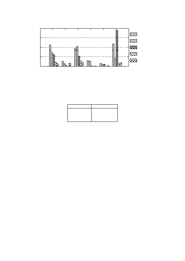
set output "plot/energislag07.fig"
# Y-label, x-label not necessary:
set ylabel "Consumption [Mtoe]"
# key in right margin, centered to graph, text Left-aligned,
# description boxes on reverse side, increased spacing
set key rmargin center Left reverse spacing 4
# We want histogram:
set style data histogram
# I think these are the defaults for histogram:
set style histogram clustered gap 2
# Cycle from pattern 0, use line as border:
set style fill pattern 0 border -1
# ytics in steps of 500
set ytics 500
# Set grid on y-axis, not on x:
set grid ytics noxtics nomxtics
# Label our data. We need rotate since text is too long. And then add a small
# offset so the first character doesn’t "touch" the graph.
set xtics rotate by -15 ("North America" 0, "South America" 1, "Europe/Euroasia" 2, \
"Middle East" 3, "Africa" 4, "Asia Pacific" 5) offset 0, char -0.25
plot \
"data/energislag07.dat" using 1 title "Oil", \
"" using 2 title "Natural Gas", \
"" using 3 title "Coal", \
"" using 4 title "Nuclear", \
"" using 5 title "Hydro Electric"
12